Blog

Colorful Hand-Woven Furniture from ‘A Rum Fellow’ Design Studio

‘A Rum Fellow’ design studio project for a Soho Hotel, featuring their textiles on a custom headboard.
 
If you’ve been reading this blog for a while then you know that I love woven and embroidered accents, whether that’s an amazing embroidered top or a truly unique piece of upholstered furniture showcasing a stunning woven design. A Rum Fellow design studio is crafting cutting edge woven and embroidered textile designs for furniture and home decor accessories, bringing contemporary energy to this traditional craft. I am loving their unique approach to upholstered furniture! Hand-weaving and embroidery is the key to making each piece of A Rum Fellow furniture feel truly special. 
 
Whaley Chair, Copii brocade and linen 
 

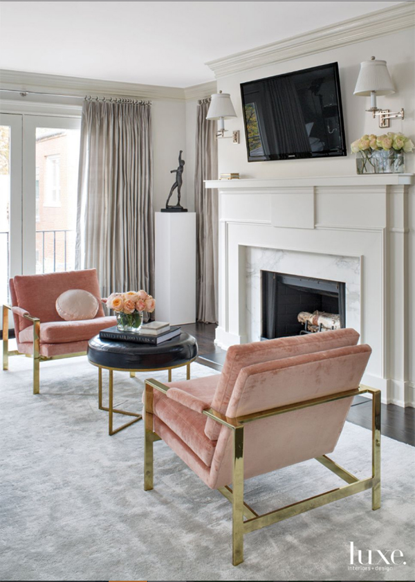
Kurt Olsen Lounge Chair #31

One of the best things about decorating with embroidered and hand-woven decor is that you can’t go wrong whether you’re selecting a bright and bold color palette or a more neutral palette. The textures in embroidered and woven designs pop regardless of the colors used, making even the most neutral embroidered designs shine. Check out this stunning neutral living room featuring a sofa upholstered in A Rum Fellow hand-woven textiles. 

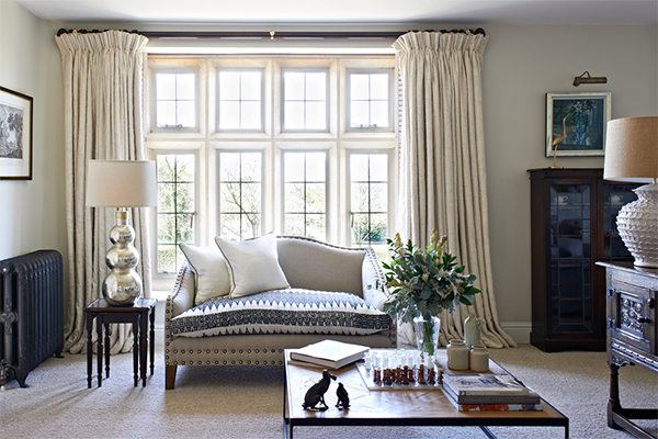
A Rum Fellow design studio project for a Country Home. 

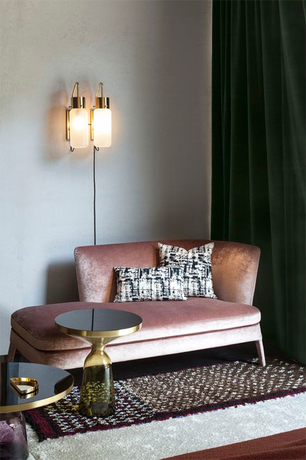
Brocade and ikat Kai Kristiansen Chairs

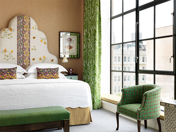
A Rum Fellow design studio project for Crosby Street Hotel.

I also can’t get enough of A Rum Fellow’s unique headboard designs, each featuring a different textile from their studio. However, my absolute favorite piece from A Rum Fellow is this amazing multicolored armchair designed for a home in Provence. A Rum Fellow is quickly becoming one of my (many) new favorite brands!

A Rum Fellow design studio project for a home in Provence.

A Rum Fellow is a London-based design studio founded by Caroline Lindsell and Dylan O’Shea focusing on hand-woven textile designs. This great team crafts textile and furniture designs that effortlessly blends the contemporary with heritage design, all from a unique global perspective.

Fashion meets Interiors: featuring Style Blogger Danielle Jackson

Hi  Dolls! I am Danielle Jackson the editor-in-style of my fashion and lifestyle blog Dani-DK.com – Where Style Has Purpose! Dani-DK is a place for women who are looking to turn the conventional upside down and explore their most creative side through style, beauty and life experience. A great space to ask questions and feel inspired!
 

This fall I’ve gravitated towards rich hues and sleek lines. From gold’s to forest green, nature has truly inspired the collections that I shop. I’ve always loved dark walls but have never lived in a home where I’ve been bold enough to paint an accent wall so this olive and navy blue room really spoke to me.


Rich colors can liven any look. Rich shades effortlessly take you look from basic to bold and add a luxe, well-made feel to your outfit regardless of the true price point.

For this look, I pulled together pieces that I’ve purchased over the years. My pants relate back to the clean lines that I’ve been obsessed with this season and I paired it with a sleek lace camisole layered with a blazer and long vest for a bold and interesting look.

As we all know colors speak volumes! There’s nothing like a bright or bold color to lift your mood. The green found in this look is considered a “bridge color” where it creates a great balance between all other colors. So just like the olive green sofa featured achieves grounding this interior, the rich green in my own look effortlessly pulls together my printed blazer and fur stole. Earthy green shades are grounding and powerful, making it a fab color palette to explore with your wardrobe this season.

 SHOP THE LOOK!

  1. Pants: H&M (similar here)
  2. Camisole: H&M
  3. Blazer: Rachel Roy (similar here)
  4. Vest: H&M (Color: Ivory Sand)
  5. Pumps: Christian Louboutin
 
Follow the adventures of NYC Image Consultant and style blogger Danielle Jackson on Instagram and Facebook. Check out more of the Fashion meets Interiors series here!
 

Home Tour with Artist Kristin Poh – of Australia’s ‘Hues & Fables’

Artist Kristin Poh of Australia in front of her “Voyage” art print.
 
Artist Kristin Poh of Australia is the founder of creative business Hues & Fables, an art studio producing unique art prints for cheerful home interiors. Kristin shares with how she uses Hues & Fables art prints to decorate her own home.
 
Melange No. 2” art print shown.
 
Jacquin: What got you started in art prints? Have you always known you wanted to be an artist?
 
Kristin: I was quite imaginative as a child, and I enjoyed doing creative things like drawing and coloring, so I knew pretty early on that I wanted to do something creative when I grew up. My interests saw me completing a Bachelor of Arts Degree in Graphic Design and then spending the following ten years working in the creative field. I enjoyed what I did thoroughly. When I had my daughter Olivia, I took some time off to embrace motherhood. It was during this time that I started to create art prints for our home and in particular for Olivia’s room.
 
I have always loved interior decorating, so I really enjoyed creating pieces that reflected my own style. Becoming a mother made me realize just how fascinating little minds are, especially in how important color is to their cognitive development. So that inspired me to design using different colors so I could change the artwork on Olivia’s walls regularly to keep it interesting for her. So this got me designing art prints and launching Hues & Fables.
 

Scarlet” art print shown. 

Jacquin: Where does your “less is more” philosophy come from?

Kristin: When I reflect on different aspects of my life, including my creative work, I find that I have always navigated towards simplicity. I love the idea of something being simplified to only what is essential. In doing so I feel what is left is in fact its true essence, and to me this represents having a more refined and therefore more valuable outcome. So fundamentally, I would say it comes from my appreciation of having clarity in what I do and experience.

Art prints shown: “Soiree No. 1” and “Soiree No. 2

Jacquin: What is your favorite space in your home right now?

Kristin: At the moment my favorite space would have to be our master bedroom. Before we had Olivia, we had the opportunity to travel to different cities and to stay in some really nice boutique hotels. One of our most memorable experiences would have to be our trip to New York where we stayed in a stylish hotel in Soho. When we decided to renovate our home four years ago, we were clear that we wanted to create a similar feel in our master bedroom. So now, even though we do not have as much opportunity to travel like we used to, being in the room brings us back to those days, and having such a stylish yet calming space to retreat to at the end of a busy day is precious to me.

Jacquin: What are some of your creative inspirations? Are there any artists or designers that inform your artistic approach?
 
Kristin: I find creative inspiration from a lot of things. It can be anything from fashion to food or a piece of furniture or packaging. As long as it is visual, has a strong concept and wows me, it will no doubt inspire me too!
 
The artist Lee Ufan – in particular his paint work – is a great source of inspiration to my artistic approach. Lee Ufan is a Korean minimalist artist and philosopher, and I first came across his work at the Guggenheim Museum in his Marking Infinity exhibition. I remember looking at his early painting series From Point and From Line, and being blown away at how simple and yet powerfully captivating his paintings were. 
 

I also find the French designer Philippe Starck very inspiring. He has worked on a vast range of design projects, from toys to furniture and vehicles to architecture. His designs are many things but they are never boring, and I have a lot of respect for his values and commitment to creating high quality designs that are beautiful, purposeful and sustainable.

Olivia” the bunny art print shown.
Eureka” art print shown.
 
Jacquin: What would your perfect day look like?
 
Kristin: A perfect day would see our family enjoy a lazy morning in bed laughing and cuddling. Brunch with great friends would follow, somewhere outdoors so I can soak in some sunshine! In the afternoon, a trip to the bookstore would see me treating myself to a new coffee table book, and the rest of the afternoon would be spent reading. At night, I would look forward to some delicious cooking from the husband, a lovely bottle of red and a really good movie to cap off the day!
 

Jacquin: Do you have any suggestions for embracing simplicity at home or in life?

Kristin: I think you need to discover what your version of simplicity is before you can embrace it, and I feel having self-awareness is key. My own understanding of what I value as a person has certainly helped me focus my energy and time on pursuing – and appreciating – a more meaningful life. It has also allowed me to create a purposeful home that brings me great inspiration and joy everyday. I think something as simple as having an honest conversation with yourself about what is important to you and what brings you real happiness is a great step towards embracing simplicity.
 
Shop the latest art prints from Kristin Poh at the Hues & Fables website. 
 

DIY Marbled Paper Organizer (or Magazine Holder)

Hi everyone! I’m so excited to have a new DIY craft for you today. I’ve partnered with the Paper Source to bring you this useful (and stylish) sponsored post and it features their beautiful marbled fine paper. This DIY idea came out of my need for a system to organize my mail and it happens to be super easy. Here’s how to make your own paper organizer (or magazine holder) in an attractive marbled design using a free priority mail box from the post office. Let’s get started! 

Materials:
1. Priority mailing box from the Post Office (medium size)
2. Soft grip knife (Xacto knife)
3. Self-healing cutting mat
4. Scissors
5. Paper Source Marbled Fine Paper in the color of your choice (or try using old wrapping paper!)
6. Mod Podge (matte)
7. White acrylic paint
8. Paint brush
9. Gold foil adhesive tabs
10. Super glue

Step 1. Mark your USPS mailing box for cutting. The front will be cut down to 5 inches tall and all other edges will be cut at 12 inches in height. See my photo for reference.

Step 2. Score the lines that you will be cutting with your xacto knife first to make cutting the box to size much easier. After you go over each line with an xacto knife, then complete the cutting process with your scissors following along your scored lines. 

Step 3. Once you have cut the box to size, then assemble the box including sealing the bottom, which should have an adhesive strip to do so, just like when you’re sealing a box for mailing. 

Step 4. Paint over the text on the priority mail box with your white acrylic paint. Allow to dry.

Step 5. Once your box is dry, take the specialty paper you will be wrapping your box in and cut it to size. In order to do this, trace the edges of your assembled box onto the back of your paper. Allow a 2″ border around the full shape you’ve traced. Once you have traced the outline of your box, cut the paper along the lines you’ve drawn. 

Step 6. Now you’re ready to apply the mod podge so that you can adhere your specialty marbled paper to the box. (You can use wrapping paper to cover your cardboard as well.) Paint the Mod Podge product onto the entire box, not missing any spaces. Then quickly coat your pre-cut paper in Mod Podge as well, covering the full backside of your paper in the Mod Podge liquid. Once the box and paper have been coated, now you can line up your paper onto the box and press it on. Smooth your paper onto the box with a wall paper roller or tile smoother (or your hands) in order to avoid bumps or bubbles. There will be excess paper along the edges. Cut the loose paper at the corners and fold the excess paper into the inside of the box. For the bottom, fold the excess paper underneath the bottom of the box. Seal the edges down with Mod Podge. 

Step 7. Once your paper is adhered to the box, immediately coat the entire outside of the box in another layer of Mod Podge. Allow your box to dry overnight. 

Step 8. The next step is to create your labels. Cut your gold foil adhesive tabs in half and then fill out your labels with a fine-tip permanent marker. Glue your labels to the front of your new paper organizers. 

Step 9. Now it’s ready to use! You may also cover the inside with white paper like I’ve done for a more professional look. Enjoy!

This easy DIY craft has solved my mail storage problem and I absolutely love the look too! I especially like that each organizer has it’s own unique marbled pattern thanks to the Paper Source’s selection of fine paper. Not to mention that my gold file tabs make the perfect accents to this luxe marbled look. Let’s just say that I’m extremely happy with how this do-it-yourself project turned out. Let me know if you decide to give this DIY paper organizer a try!
 

Up to 60% Off Luxury Home Decor

Falling for Velvet this Season: Velvet furniture inspiration & shopping resources

Home featuring Z-shaped chairs in bikini-fit emerald velvet cushion by Pollack, via LuxeSource, Brantley Photography
 
Now that colder weather is rolling in you finally have an excuse to enjoy warmer, richer fabrics around your home. I recommend giving velvet a try this season. This classic fabric can be styled traditionally or in a more contemporary or edgy manner, depending on the style of furniture. Here is some amazing inspiration for decorating your home with velvet, along with a few great resources for sourcing velvet furniture and decor for your space. 
 

Kensington drawing room designed by GZ Interior Design.

Vintage chairs designed by Milo Baughman upholstered in Pierre Frey linen-velvet, via LuxeSource, Photography: Meghan Beierle-O’Brien
 
Velvet upholstery will go well in your living room or dining room as showcased here. You can even select velvet fabric to upholster your bed’s headboard for a luxurious look.
 

Louis XVI chairs from 1st Dibs upholstered in Schumacher velvet, via LuxeSource, Photography: Cynthia Lynn

Velvet chair with metal frame

Want to create a bold or contemporary look utilizing velvet? Try selecting velvet upholstery paired with tufted pieces like the stunning armchair above, or combine velvet with various metals to create edgy and contemporary juxtaposition. Another fool proof way to go bold with velvet is by using really bold and bright colors like this rust orange velvet sofa below or something like a fun shade of chartreuse or deep teal to mix things up. 

Designed by Arent & Pyke’s, via IN/OUT Design & Lifestyle

Ligne Rose Toga Sofa upholstered in velvet in an Australian home, via The Design Files, Photography: Eve Wilson
 
So where can you source the best in velvet furnishings? Try one of these great retailers.
 
1. On a budget – World Market
2. For the moderate price point – High Fashion Home
3. For the luxury shopper – Horchow
 
via Sight Unseen, Photos by Silvia Rivoltella
 
Already enjoying velvet at home? Share your photos of your favorite velvet decor on Twitter & Instagram and tag @Jacquinmh to share it with the blog. Can’t wait to see how you’re adding a touch of luxury at home with velvet!
 

A Chat with Que Duong: NYC Photographer and Creative Director


Que Duong Photography: “Sorbet” series

I have recently come across the creative work of NYC photographer Que Duong who has truly inspired me with his unique style and perspective. Que began in the fashion and beauty industry working in content creation and has since launched himself to the status of creative director, sharing compelling and sometimes edgy stories through his creative photography. Read on to catch my recent chat with this impressive, creative photographer.

Jacquin: Hi Que! You mention that your main source of inspiration is “the anticipation of life’s normally overlooked moments.” How do you manifest this in your work?

Que: We often look for the “big boom” in our day. In contrast, I look for the small moment such as drinking tea and creating “the big boom” around these thoughts and moments.

Que Duong Photography: “Colour Walls” series

Jacquin: Your photography has great energy and an exciting perspective. How do you begin to visualize and conceptualize your compositions in your photography?

Que: Majority of my concepts originate on my current mood at the time. I embrace all the spectrum of emotions whether it is sad or joy – it helps me create a story to tell. From that point, I researched the symbolism and metaphors. I translate those emotions and use it as starting point to create my compositions and content.

Que Duong Photography: “The New Band” series

Jacquin: What was your inspiration for “The New Band”? Is there a message behind these works? “The New Band” actually reminds me of a 1940s photo of historical Chicago by Russell Lee. I love this photo series, Que and really all of your works!

Que: Visually, my inspirations were from the vinyl covers of music groups. In term of the underlining message, I wanted to tell a story of the daily lives of the Brooklyn kids; to showcase the beauty of the simple moments such as sitting on the stoop with your friends, standing on the corner waiting for the bus, or going to church. Overall, the message I wanted to convey and bring to attention is “black is beautiful” – ‘til this today, it is still one of my favorite shoots!

Que Duong Photography: “The New Band” series

Que Duong Photography: “The New Band” series

Jacquin: How do you go about choosing the models for your shoots? (random, search for them, or you know them personally)

Que: Majority of the times I have casting calls. This allows me to use models that fit the concept.

Jacquin: How does your cultural background or surroundings influence your work?

Que: My cultural background and surroundings are extremely influential in my work. I am a Vietnamese kid raised New Orleans, a city that is surrounded by Jazz and magic! This colorful city often serves as a color palette for my work. I enjoy and draw energy from our laid-back attitudes and philosophies. It helps me conceptualize the simplest stories.

Que Duong Photography: “The Jazzman” series

Que Duong Photography: “The Jazzman” series

Jacquin: Are there any events or experiences in your life that have impacted your career as a photographer?

Que: Yes, social media! When I first started out, I was solely focused on fashion. Since then, I came to find my love for lifestyles and still life photography. This started out with my first job with Revlon – creating their social media content.

Que Duong Photography: “Madame of the Cloud” series

Que Duong Photography: “Madame of the Cloud” series

Jacquin: What type of projects are you most looking forward to as you move forward as a photographer and artist?

Que: Right now, I am working on cinematography and getting back into my painting (a passion of mine). I am looking to doing more creative direction.

Que Duong Photography: “Madame of the Cloud” series

Jacquin: You create uniquely artistic self-portraits. Do your self-portraits function as a means of self-representation, or do you regard yourself more as a character telling a story? (Check out one of Que’s self-portraits below.)

Que: My self-portraits are mirror reflections of who I am. It is my way of writing my autobiography in a creative way, haha.

Jacquin: What would the perfect day be like for you?

Que: A perfect day for me would be waking up on a sunny Saturday’s morning, watering my plants while drinking Vietnamese coffee and jamming to 80’s pop (my go-to song is When in Rome – The Promise). Start with a trip down to Union Squares to buy more plants and have lunch in Chinatown. I would commute back to my cozy Harlem apartment and binge watch old shows on TV while I edit photos. Wrap up my day with a candle lit night and dancing to old school r&b tunes.

Self-portrait of NYC photographer Que Duong.

Follow Que Duong‘s photography and creative direction through his website or via his inspirational Instagram page. 

Ditch the Bath Mat: Luxe Area Rug Ideas for Your Bathroom

Bathroom designed by Amber Interiors. Photography: Tessa Neustadt

When it comes to selecting something soft for under your feet in the bathroom, most people go for a traditional bath mat, most often sold in tiny sizes. However, I want to convince you to ditch the boring bath mat and go for a more stylish area rug selection for your bathroom. Choosing an area rug over a bath mat will have the benefit of more exciting patterns to choose from, along with broader size selections for larger bathrooms.

Today I’ve rounded up my top 5 examples of chic area rugs in bathrooms.

Toronto home, Image via The Zhush.
So, when is the last time you’ve popped into a store to see basic bathmats available in just a few basic designs and sizes? The truth is, if you want a more ornate or unique bath mat design for your bathroom, you’ll likely have to head to the rug section to find the best variety. So I’m hear to encourage you that there is absolutely nothing wrong with that. Go forth and shop the rug section for your next bathroom refresh! 
Image via BellaMumma
Whether your bathroom is smaller or larger, a luxe oriental rug, or another equally ornate rug selection, will have high impact in your bathroom visually. For example, I love the unique look of the circular polka dot rug shown above. It adds a custom feel to the space, especially since you don’t typically see circular rugs in bathrooms. For larger bathrooms, when you’re shopping the rug section instead of the bath section, you’ll find rugs that are more appropriately sized for larger bathrooms. The oriental rug shown below is a perfect example of how an oversized rug or runner can transform a bathroom. Make your bathroom fabulous by selecting a rug over an average bathmat!
Interior design by Amber Interiors

Denver farmhouse designed by Carlos Alvarez of Alvarez Morris. Image via Luxe Source. Photography: Emily Minton Redfield

Will you be switching from a boring bathmat to a luxurious area rug in your bathroom? You’ll love it!

Ideas for Incorporating Color-block Painting at Home

Image via SF Girl By Bay

Color blocking is the visual style of pairing blocks of solid colors in often-unexpected ways. Color-block painting can be quirky, refreshing, and surprisingly luxe in an interior space. From Piet Mondrian’s primary-colored paintings to the emergence of 1960’s Mod fashion, color blocking has proved to be a lasting trend. Based on the concept of placing bold colors together for an eye-catching effect, this colorful technique is not only for fashion. Applying pops of color to your walls could be just what you need to invigorate your space.

Image via Vtwonen 

Image via Design meets Style

The color-blocking concept often brings to mind bright and contrasting hues, but the color and design possibilities are virtually limitless. Consider the whole spectrum of the color wheel; both saturated and toned-down hues can make a big impact. Pastel colors can breathe new life into a room, while a neutral shade can make an elegant, streamlined addition.

Image via Avenue Lifestyle

There is also a lot of room to play with shape and design. Large swaths of color can take the form of one painted wall, door, ceiling, or perhaps horizontally divide all your walls into two shades. Think about experimenting with diagonal and vertical lines as well for a dramatic emphasis. Playful geometric shapes such as circles and triangles are also an interesting design element, and achievable through the use of stencils and painter’s tape. There are so many options to consider when decorating with color block painting, and the effect can be whatever you choose.

Image via Enter My Attic

Image via The Decoist

Make sure to incorporate objects in the room that mimic the color or shape of the color block painting, for a feeling of harmony and unity within the space. If you decide to go bold with a circular shape, other round or circular shaped elements will be pleasing to the eye and create a coherent flow.

Most importantly, think about the particular colors that bring you joy. Incorporating your favorite hues into your life space will put a smile on your face each time you enter your home.

Coyuchi.com-100% Organic Bed, Bath, & Baby! Free Shipping On All Orders Over $200 At Coyuchi.com!

Artist Spotlight: Katherine Freeman of Katherine Freeman Original Art

In September of 2015, artist Katherine Freeman began selling her work under the brand Katherine Freeman Original Art and today it is my pleasure to introduce both her and her work to you. Her use of watercolors, oils paints, and charcoal lend to both serene and bold pieces that seem to pour from the canvas.

Hi  Katherine! Thank you so much for taking the time to let Interiors by Jacquin readers learn more about you and your work. When did you did decide to follow your passion for art?

Katherine: After graduating from The University of Alabama (roll tide) I got my Real Estate license and began work full-time as a Buyer’s agent for my mom who has been in the Real Estate business for the last 13 years. I was creating art on the side in my free time, so I decided to share my work via Instagram/social media. One thing led to another and people wanted to buy my work so I was like, why not? Getting paid to do something I am passionate about is more than a dream come true!

Katherine Freeman’s artwork shown in a residential interior.

Artist Katherine Freeman uses clippings from magazines, fashion, & other media to inspire her artwork. 

What is your inspiration when you create? 

Katherine: Everything around me! I have created my studio space to be all white, bright and airy allowing my work to be the color and I believe that has played a major role in influencing my style and various mediums that I use. I love bringing in magazine cut outs, any type of organic shapes, and sometimes even paint swatches to inspire my work.

I am greatly influenced by interior design, textures, patterns, and the contrast between colors. I enjoy following interior designer’s social media accounts and always love seeing the various trends and colors designers are using. I am no pro when it comes to interior design, but I do get such a thrill from looking and putting things together. I see amazing rooms and I instantly envision my work in them – that is how I know if I have created a good piece or not.


How does your art evolve from beginning to the finished product?

Katherine: Abstract art is such an intuitive process and my work is constantly evolving. I do love working on paper, however I absolutely love working on super large canvases. To some people I think big can be overwhelming (I remember feeling that way at first), but to me, the bigger the better! I typically begin every piece with a similar process and that is usually applying very large brush strokes with whatever colors I may choose and then adding oil pastels to help find the movement and composition of the painting.

What people don’t realize with abstract work is that you can’t be afraid to mess up. Some of my most favorite paintings have come from accidents made on the canvas that I quickly embraced, an then they became areas I didn’t want to cover up. Embrace your mistakes, because sometimes those mistakes can also be very hard to replicate!! Once I feel like I am finished with a piece I let it hang in my studio for a few days. I love hanging the piece so I can see it right when I walk in the door. Based on my first look when I walk in the door, my intuition always tells me if it’s complete or not.

How does your passion and creativity for art flow into your everyday life?

Katherine: I think art is more than just paint on canvas. Being creative in every aspect of my life challenges me to always be looking for new ideas whether it be in fashion, design, or art. I have a style and I believe my work encompasses that. I do want my work to exude positive feelings and emotions, so I try and surround myself with those everyday. With creativity though comes ideas galore, and my mind is literally always spinning!

If you could choose any subject for a piece, what or whom would it be and why?

Katherine: I would have to say I would choose my interpretation of people. It is something unexpected from me and I have not had a chance to experiment with yet, but hope to in the near future!

If you’ve loved the photos here, head over to Katherine’s site for more artwork, as well as information on commissioning a piece of your own. If you are interested in staying in the loop of all things Katherine Freeman Original Art, follow her on InstagramFacebook, and Pinterest.